The Problem: Technical Debt & Churn
At the beginning of 2014, the textPlus Product Team came to the realization the current platform was becoming outdated and slow; technical debt was ever-growing and users were churning out of the app. Faced with fundamental scalability issues and a platform susceptible to attacks, it was time to make a change. New technologies were now available to make the app faster, more stable and secure. One of those technologies was XMPP, which would drastically improve our messaging speed and efficiency. textPlus had been a success, with over a million DAU's at the time, but it was time to rebuild from the ground up, learning from past mistakes and starting fresh.
Interactive prototype for sliding value-prop screens.
What is this New Product?
The Product Team, consisting of myself, our Creative Director and 3 Product Managers, had some serious questions to ask ourselves:
- Do we rebuild as textPlus?
- Should we launch a completely new SKU?
- If we launch as a new app will we lose all of the brand equity we built with textPlus? The textPlus name was valuable in search results and the minds of the consumer.
- Who's going to build this thing, our team or someone else?
After much deliberation, it was decided a new SKU would serve best. We didn't want to disrupt the satisfied segment of the current user base and risk additional churn if this new platform didn't migrate so well. If this new app was successful, after some time we would migrate existing textPlus users to the new code-base. We decided to keep our engineers hard at work on our breadwinner textPlus and not introduce any new features during the development of this new app. A great development company out of Estonia, Mobi, would be contracted to build this project. Our CTO had worked with them in the past at Skype.
Early multi-SKU design.
Business Goals & User Goals
Product began creating spreadsheets of improvements, business goals and features we could introduce. At this point, textPlus had both messaging and VOIP calling capabilities, and many of the teams ideas were based on Facebook's multi-SKU solution with the launch of Messenger. textPlus was a bit bloated because we combined both calling and texting into one app, causing performance issues. We decided to initially break up calling and texting into to different apps that linked and launched one another. This decision would change much later, and we would once again unite the experience.

Zack in approval at a UX meeting.
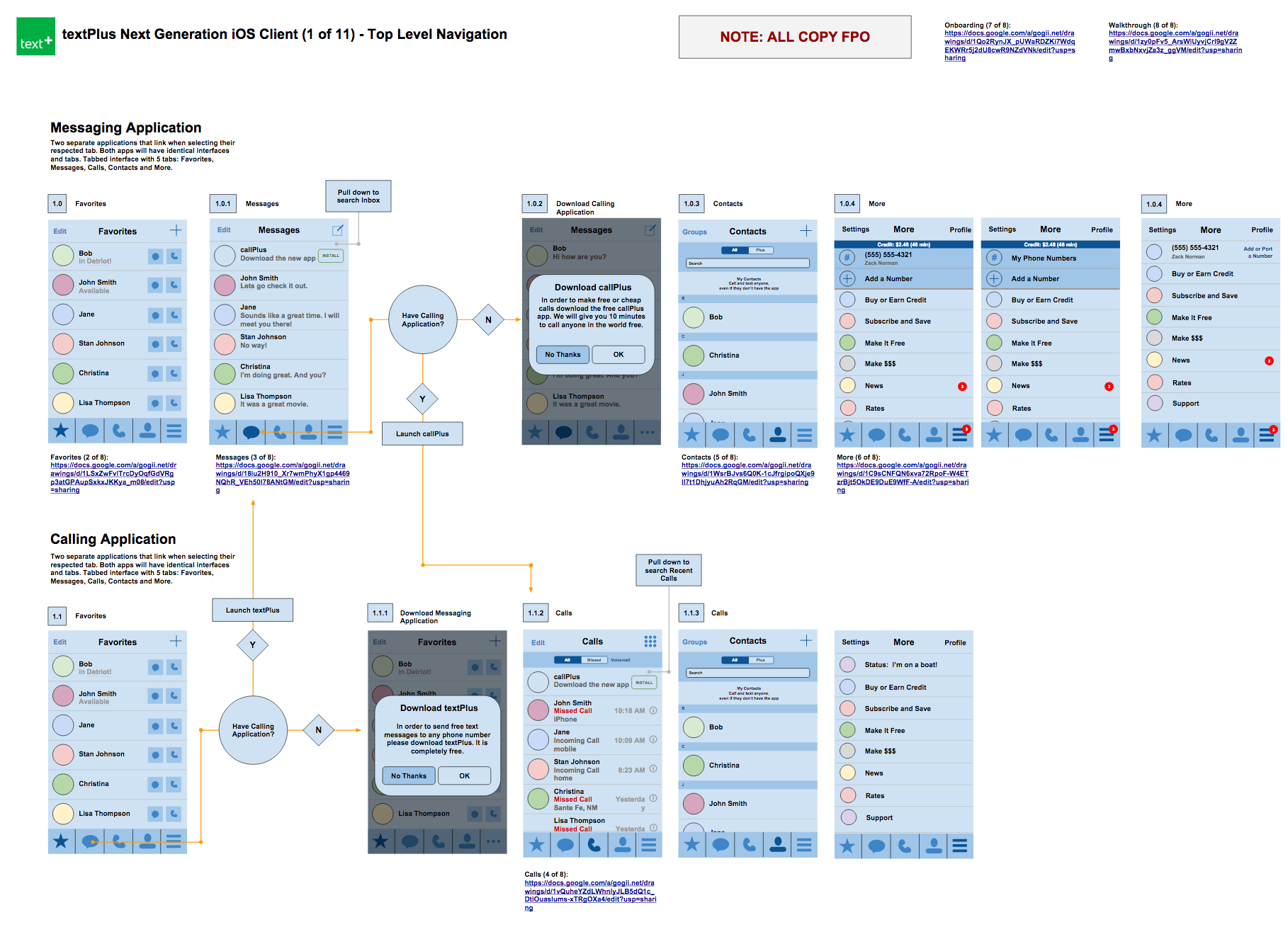
Once Product had answered some pretty tough questions, I began designing wires for this new app. I began by sketching parts of the app in my notebook then applying them to wireframes in Google Drawings. Google Drawings proved to be a very effective tool for wireframing on past textPlus projects; it's perfect for low-fidelity collaborative work, the team could view and comment on the wires in real-time. This iterative process took about a month, discussing every part of the app with the team along the way. We printed giant posters of the wires and hung them in our meeting space to go over them weekly. Printing the wires enabled us to write notes and circle parts that were confusing and troublesome.
Early wireframes for Nextplus.
Once wires were finalized we flew in some key developers on the Mobi team to discuss the project and go over the wires in detail. I discussed with them the existing problems we faced with textPlus and our goals for this new project. They gave crucial feedback on key parts of the app and fresh insights to tough problems. This allowed me to make adjustments before going further with design. It proved to be an exciting and beneficial week at textPlus.
Nextplus Branding

Early logomark and logotype explorations.
So what do we call this thing? The textPlus name was great because it was descriptive to what we do, texting PLUS more. However, this name was also limiting with the emphasis on the word "text", since we provided so much more. The team debated on and off for weeks, and when the dust settled we eventually decided to change only one letter and name this new product Nextplus. It would be the "next" generation of messaging and calling applications. This allowed us to expand on the "plus" name and retain some of that brand equity. It was an unpopular decision at the beginning, but it grew on most everyone at the company eventually (especially after the coffee mugs arrived!).
The final four "N" logomark choices. All chat related.
The final horizontal lockup.
The Interface
Early on, Creative Director Zack Norman and I created some design ethos; basic principles to guide our design decisions. The overarching principle we applied was "make it native". This meant design it as close to the users native messaging and calling apps, and go from there. This was for many reasons:
- Reduce cognitive load, since it all looks and works familiar to the apps users are already using.
- Design fast and build fast since there are easily referenced working prototypes!
- Focus on building other exciting and complicated new features (we were a design team of one after all).


Obviosuly we were eventually going to build things that didn't exist natively, which was the fun stuff we will get into later. For these reasons Nextplus doesn't have a flashy UI, over-the-top micro-interactions, and experimental color palletes. It just works and works well.
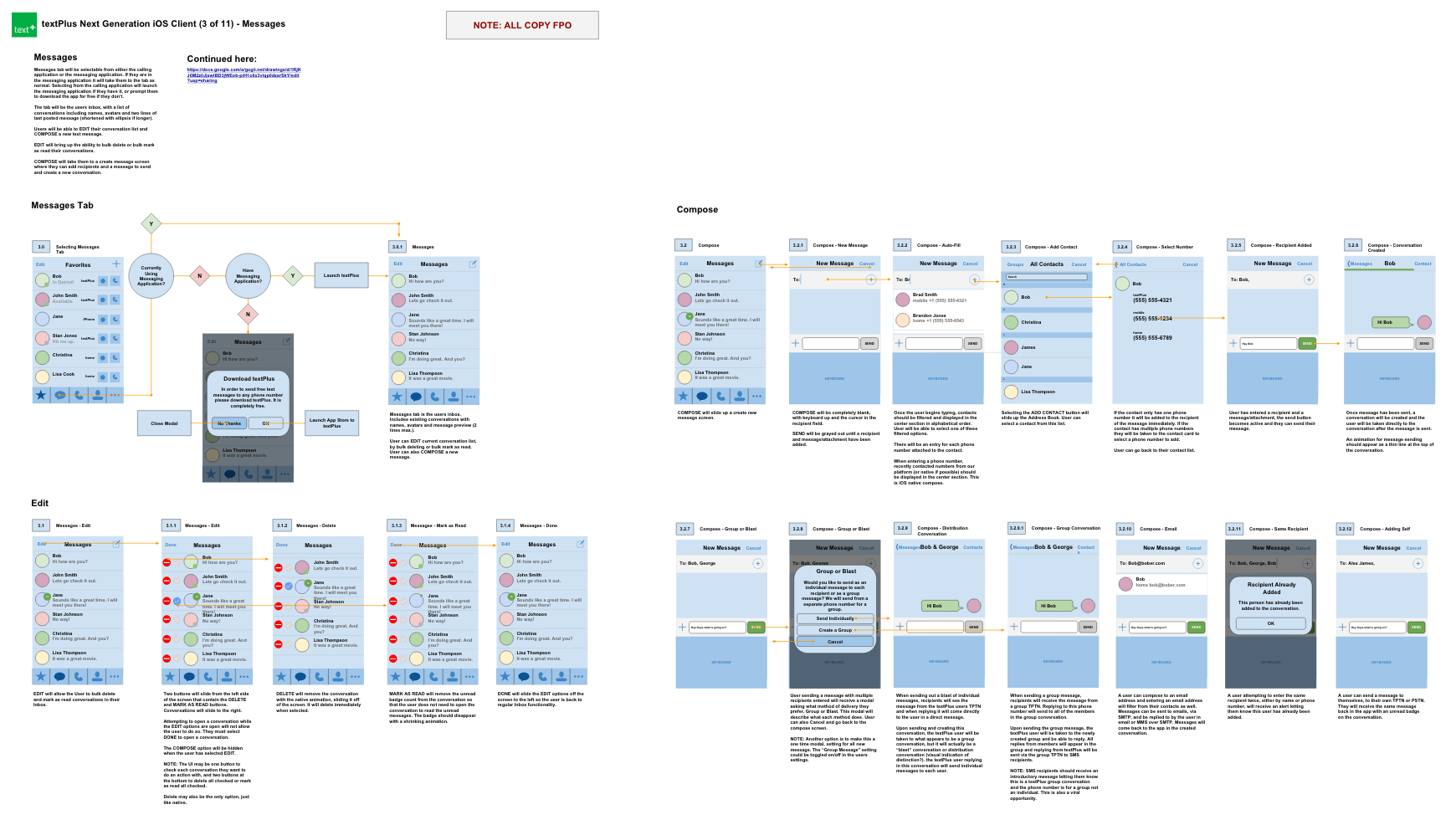
Even with our simple approach, there were some tough design problems we had to solve. One of these was our dialer. We need to be able to display:
- The number dialed.
- The country dialed.
- The name in address book (if applicable).
- A rate for the call.
- The users existing credit balance.
- How many minutes they have avaialbe for the dialed call (if applicable).
- Promotional copy to invite the number to Nextplus if not on the platform.
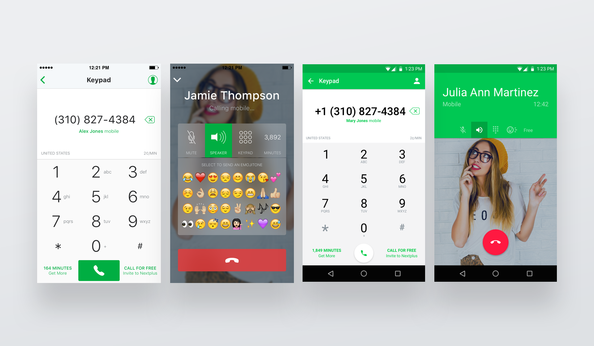
Contextual information when a number is dialed.
All of this while still having a keypad and call button to make a call! It's safe to say real-estate was an issue. We produced many versions of this screen, finally landing on a solution with all of the information properly laid out.
Development & Long Nights at Mokü
Once development began with Mobi I was fortunate enough to travel and join the team in Estonia. My role was to guide the team through any design questions and lead them through sprints. We worked from their office in central Tartu, a beautiful college town in Estonia. My time spent there was incredibly productive, as we layed a lot of the foundation for the app in that time.

Roman wore the chicken suit for my last day. Yes, THE ENTIRE DAY!
This was my first time traveling abroad for work and it was amazing. I traveled with one developer from our team, Pablo, and we spent our off time exploring Tartu and nearby towns. Most nights we hung out at Mokü, a local bar the size of a small office owned by Veiko, the founder of Mobi. We fished on a boat in Lake Peipus, ate pork shoulder at an old Gunpowder Factory (delicious!), and even played some drunken Rock Band late nights at the office. It was an experience I will never forget.
The ‘Plus’ in Nextplus...The Fun Stuff!
The vision for Nextplus was to offer an improved messaging and VOIP calling service as well as additional innovative telecommunication and social features. We had the idea for awhile to incorporate games into chat, rather than the adverse which had been done for a long time in most mobile game apps.
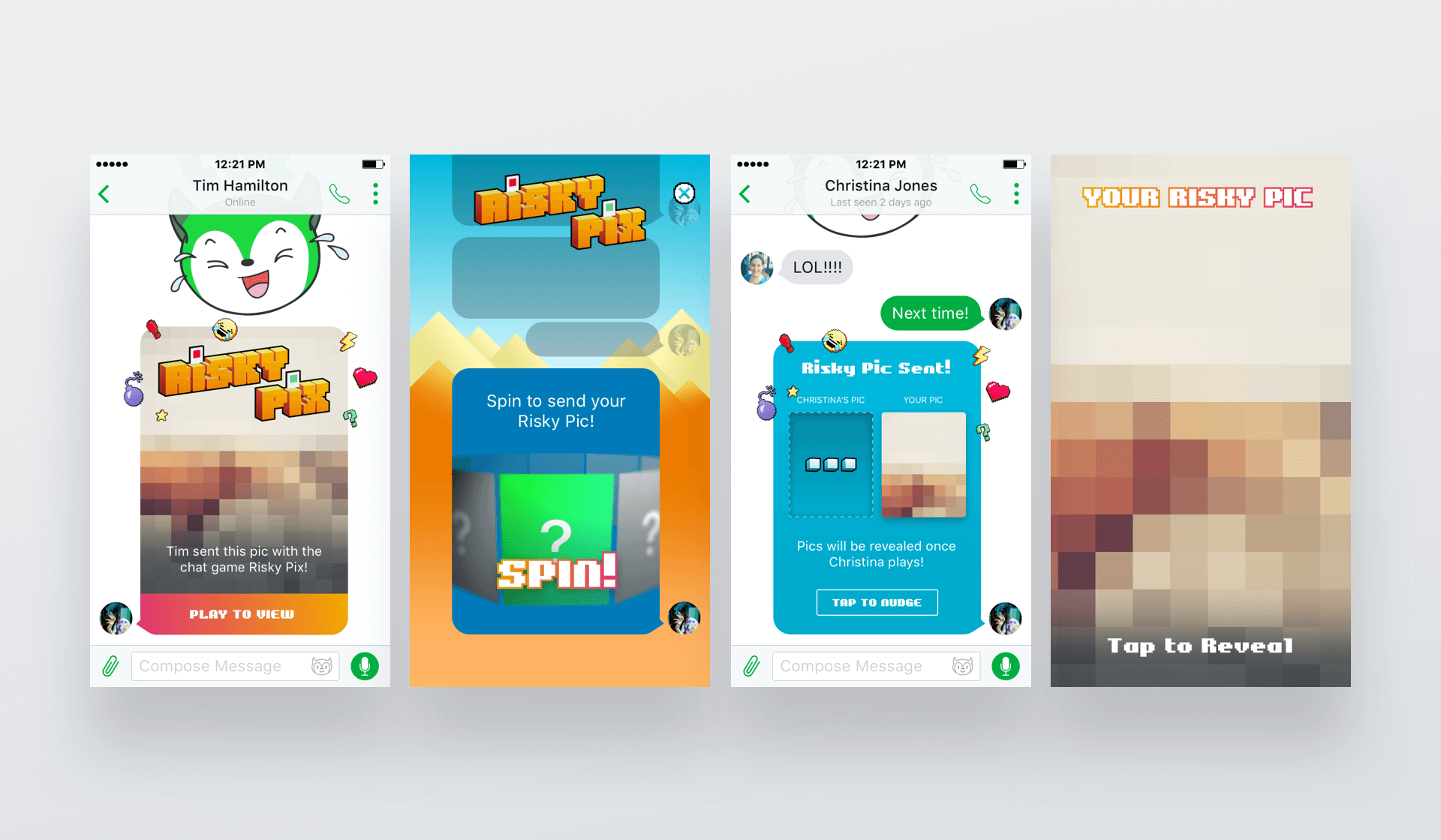
Risky Pix – send a random pic from your library and receive one from a friend!
Games would be in the context of a chat, with turns in the game going back and forth like a conversation. This was WELL ahead of iOS 10 Messaging feature-set and iMessage games, well ahead of it's time. We even developed a tab at the top level navigation in the app dedicated to the fun features, "+FUN". In a conversation view, Nextplus has an attachment tray with activities you could do in the chat. We would call these Chativities (coined by yours truly).
Our first chat-game was called Risky Pix. The game, a brain-child of our Creative Director Zack, was as dangerous as the name implied. Each player is asked to spin a wheel of their own photos from their phones photo album and share a random photo. Once both players had spun and sent an unknown photo, both photos would be revealed.
First prototype of the Risky Pix spin-to-send mechanism.
When we launched the game we noticed a spike in downloads, and reviews letting us know they had downloaded the app just for Risky Pix. The virality through the invites we designed was a major factor in this spike. Many ideas sprouted from the success of Risky Pix. One idea was to develop a standalone chat game app, which has yet to become a reality. We laid out the UX for many more games and developed one more called Selfie Time which has yet to launch.
Prototype for Lucky Call, a random-match calling feature.
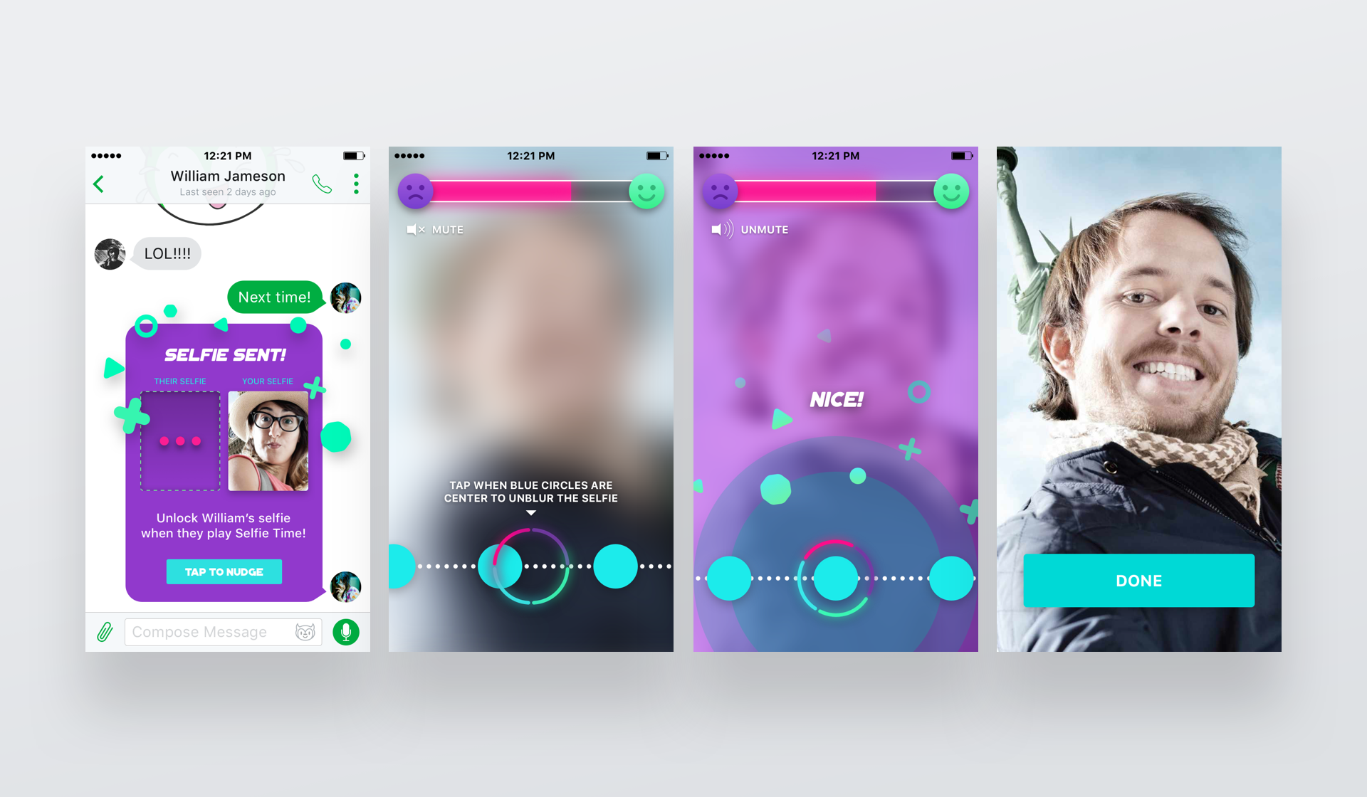
Selfie Time – a tapping game to unlock selfie photos taken in the game.
We built many more fun features that innovated on the voice side as well. Lucky Call was a feature that matched up users with random callers, like a voice only version of Chat Roulette. Emojitones was a feature that allowed Nextplus users to send "emoji sounds", sounds that represented emojis on a soundboard, during a phone call with anyone. These fun features were eventually grouped and displayed on it's own tab called +FUN.
Launch and Reception
When Nextplus launched we created a modal in the textPlus app prompting users to upgrade to Nextplus, the same great app only better. This created a surge of downloads and rocketed us to the trending list on Search of the iOS App Store and trending section on the Google Play Store. We received high praise for the new design, especially the fresh Material Design aesthetics of the Android app.
Current app store ratings on Google Play and iTunes.
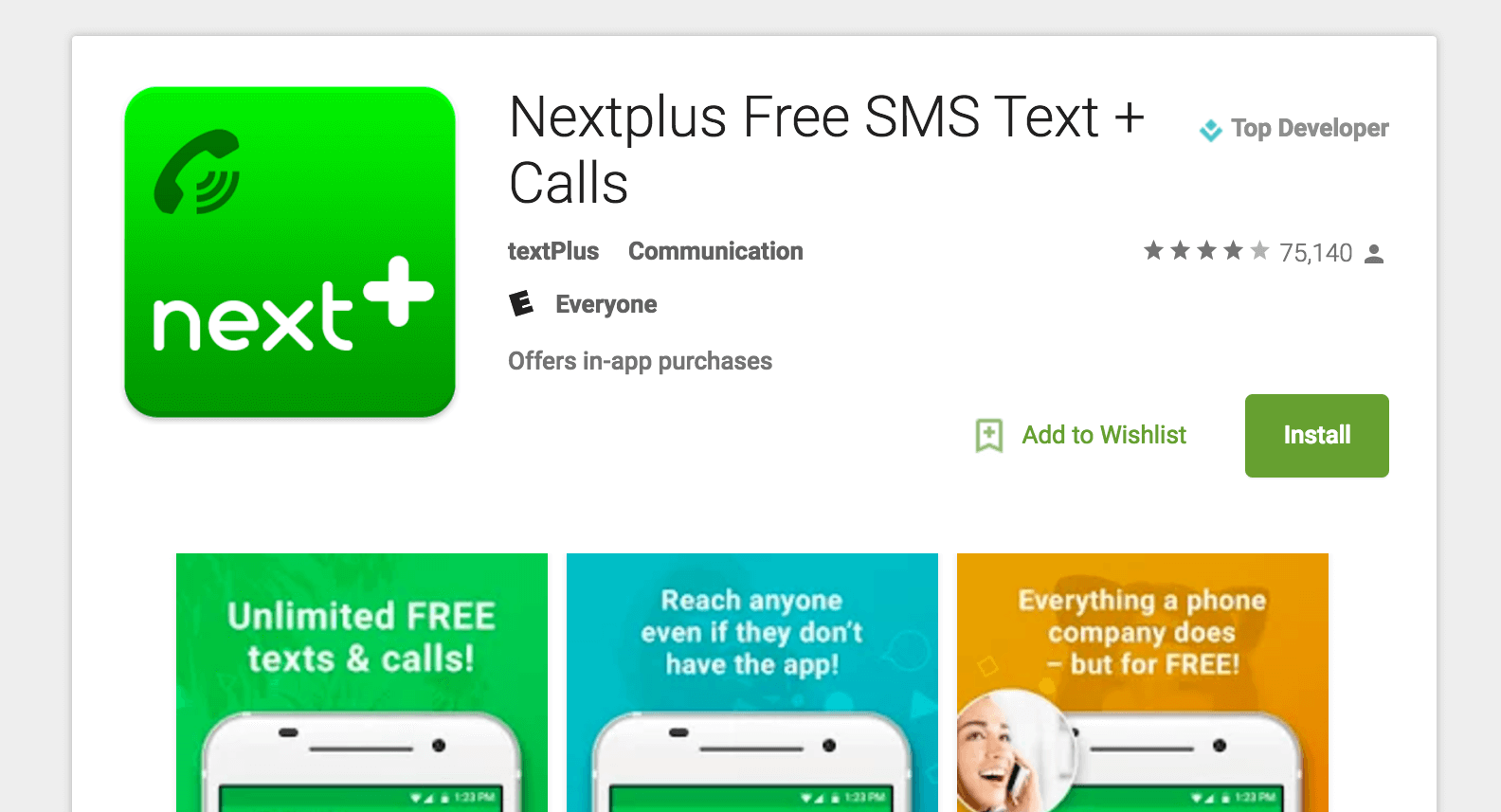
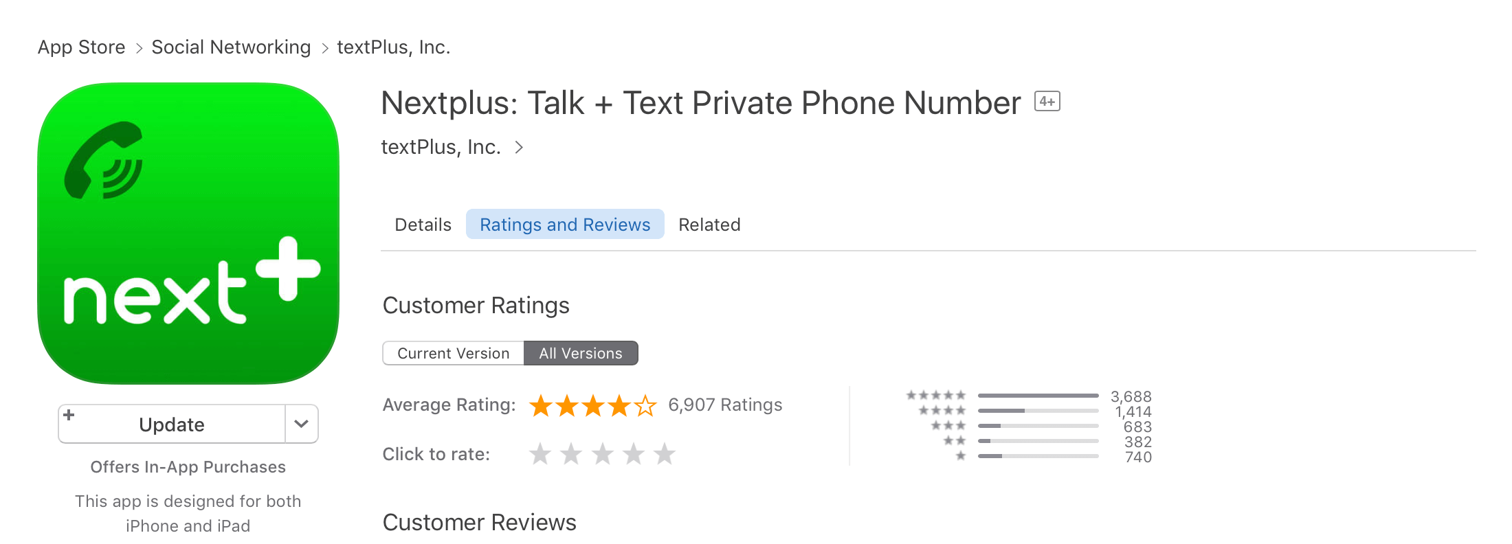
As of writing, Nextplus has a 4+ star review with over 75k+ reviews on the Google Play Store and 4.5 stars with hundreds of reviews on the Apple App Store (not as active of a reviewing community on iOS). Our app store rating is something we have always taken pride in at textPlus/Nextplus, and we love the engagement we have with our beta user group on Google Play.
textPlus now shares the same code-base as Nextplus, successfully migrating millions of user accounts onto the greatly improved platform. Now, both apps are nearly identical with the exception of a few visual assets. That was the goal of this project when we set out, and after over a year we had accomplished just that.
What Did I Miss?
I realize I'm leaving out a ton of interesting commentary, there is far too much to talk about. I've designed every part of Nextplus from onboarding and sign up, to push notifications, to the credit system, to settings nags, to incentivized invites, and on and on (unapologetic humble-brag). If you have any questions feel free to drop a line anytime, I would love to hear from you!


