‘textPlus 2.0’: A New Experience
I joined the textPlus design team in late 2011, as a Junior UX/UI Designer. During that time textPlus was already an app store hit with millions of downloads and nearly a million DAU's. We consistently ranked among the top 3 in search results for "text messaging", offering real text messaging to real phone numbers from any device – a service only a few apps at that time offered. However, as competition in the messaging space grew and our plans to add calling as part of the app, we needed to build something new. A new app with a fresh new interface and the ability to call any number, from any device including your iPad or iPod (still relevant in 2011!). Enter textPlus 2.0!
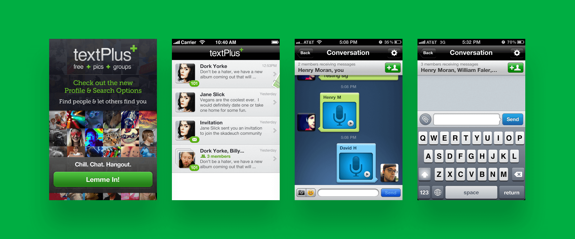
A collection of tP 1.0 screens. SKEUOMORPHIN' TIME!
Pushing the Envelope: A Unified Inbox
We started from scratch. Our team of three designers begin sketching and wireframing ways this new app would function with the new calling feature. Where would the user access the dialpad? What about their address book? Where would they see their call log?
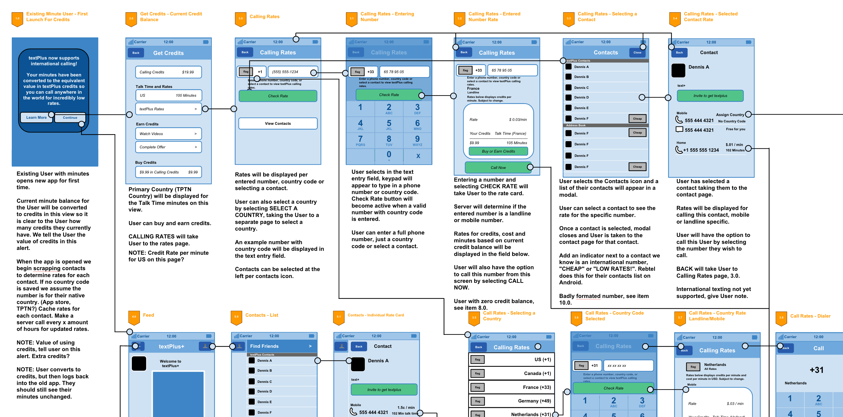
Calling credit wires.
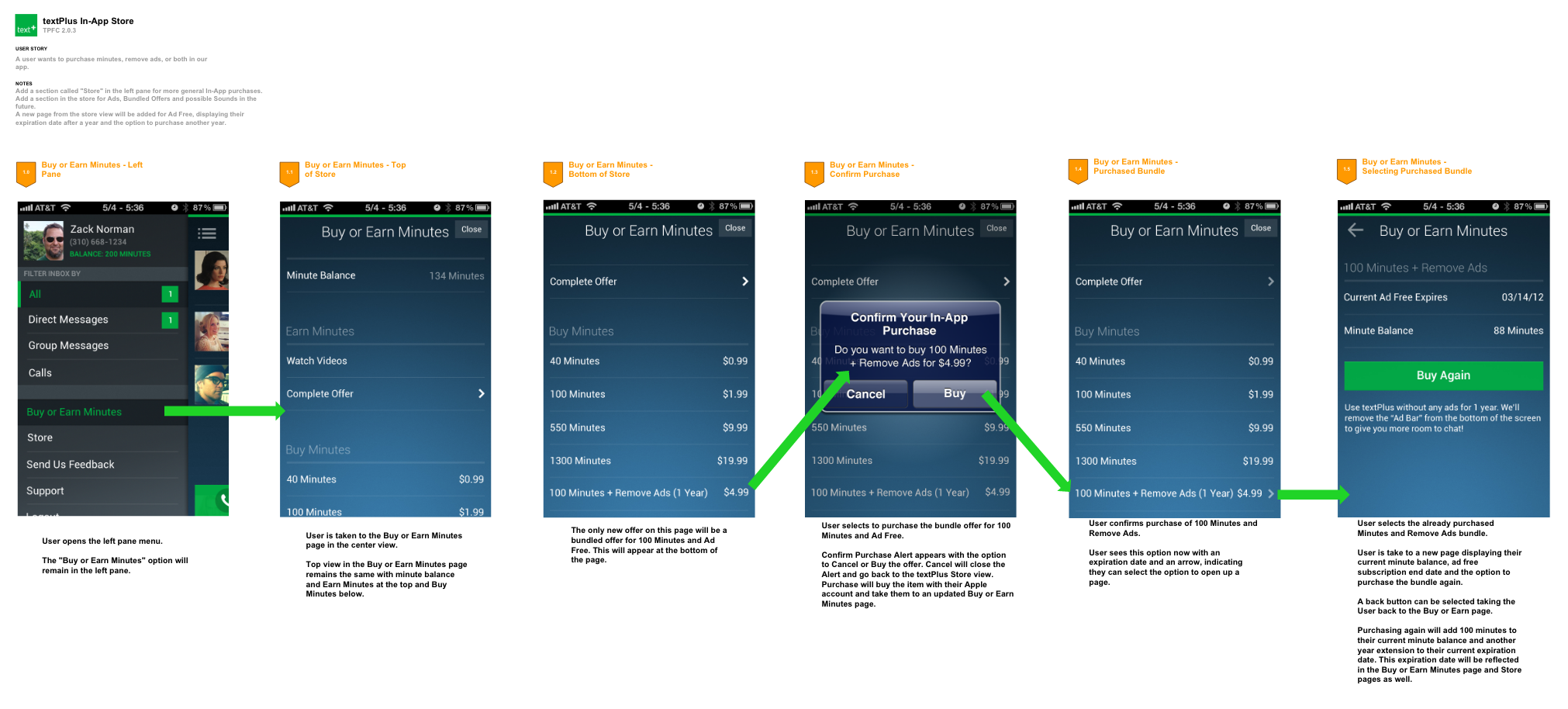
Purchasing credit flow.
This was an exciting time for our team, not only was calling adding a new revenue stream for the company, but it was a chance to make something truly innovative and useful for our users. We iterated on our designs for a few weeks, reviewing and brainstorming on ways to push the envelope and make the experience of calling and texting even easier and more useful.
Enter the "Unified Inbox". Our experiments questioned the need of separating texting and calling into different tabs or experiences based on these communication modes. In reality, when we talk to each other we only care about the people we are talking to and the message we relay, not the mode we talk to them. We fell in love with the unified inbox: organizing all media, call logs, text messages, photos, and voicemail into conversations rather than dividing them into call types vs message types. We felt this was truly innovative (and it turned out to be ahead of its time).
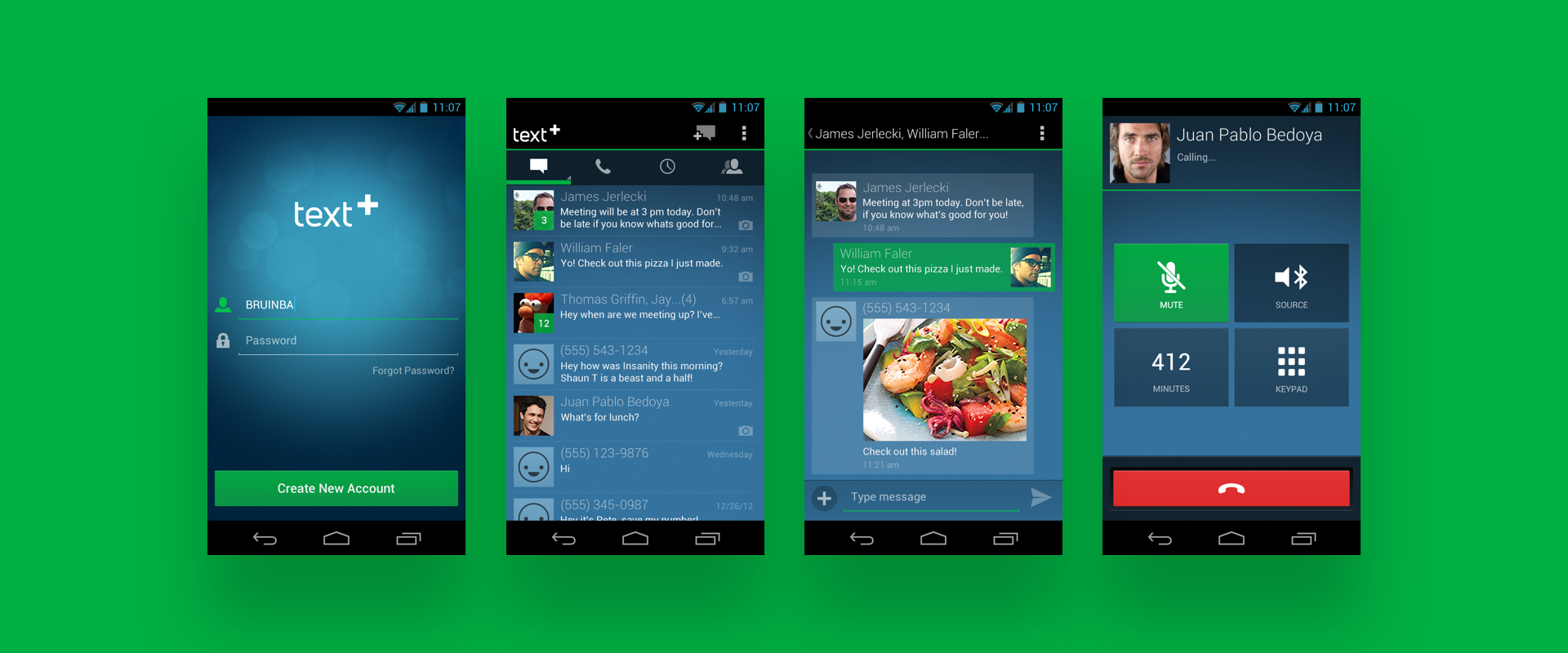
textPlus 2.0 Android.
Innovating on UI with Flat Design
Another thing the team was excited about was updating the interface. In 2012 skeuomorphic design was still very much alive and thriving in digital products. textPlus still embraced those heavy highlights, inner-shadows and paper textures. Imitating real world interactive elements worked in the past, but did users still need this direct correlation between physical and digital?
Animation when upgrading the textPlus user account.
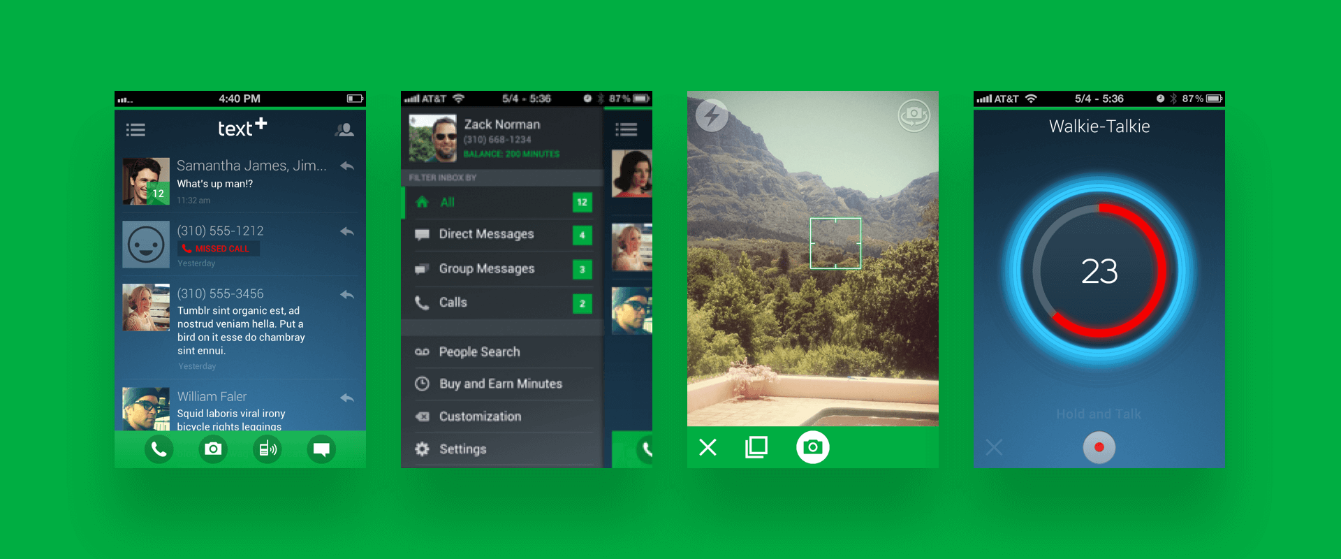
Unified inbox. Flatter UI. Transparent cells.
Around this time, the Windows phone was being introduced and its interface was very anti-skeuomorphic. It was flat and graphical, and it was just as effective and beatiful as the carefully crafted buttons, nav-bars, and icons of past. It was refreshing. Not many, if any, mainstream apps at this time had a flat UI on iPhone or Android. We felt this may be a way to move forward and differentiate ourselves visually. It was a hard sell to the team but eventually we landed on a good balance of flat UI with minor skeuomorphic elements.
Working on a Team
This was the first design team I worked on coming from a freelance design background. I learned a lot about splitting up the work load and syncing design ideas. There were many tools we used to help us get on the same page: Dropbox, Google Drawings (surprisingly simple and effective especially for UX docs) and Adobe Fireworks were the tools of choice. Working on a team with talented designers was inspiring. When one person had an idea for a new interaction or layout we would rally around that idea, refining and experimenting.
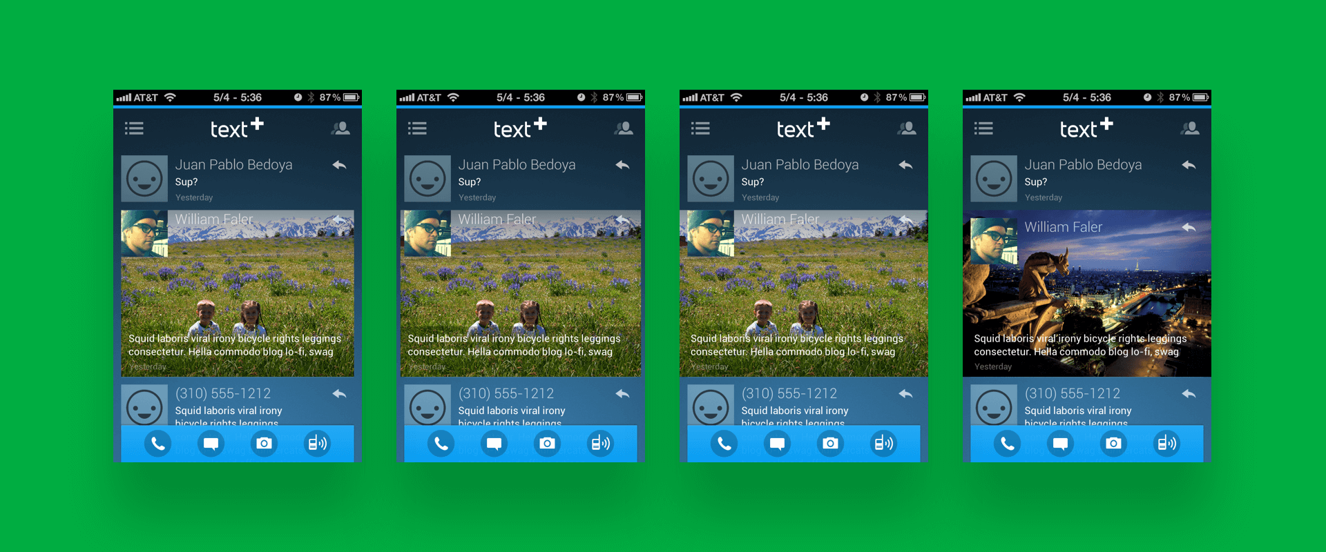
Inbox view of photo messages. Customizable interface in blue.
A great example of the team experimenting would be photo messages. If a user received a photo message from another user, instead of showing an icon that a photo was received, we would display the actual photo full bleed in the inbox list view. This would essentially make tapping into the conversation to view the message unnecessary. The idea was to make the top level view as efficient as possible. We even designed a quick reply button for each conversation at the top level, allowing a user to type a reply from their inbox not needing to go into the conversation and load all of that conversations messages.
A fun graphic I designed for the Facebook and Twitter cover photo.
What Did I Miss?
There is so much more to discuss and would love to go into detail on different parts of the app. There were many challenges: an international credit system for calling, ads, localization for dozens of countries, and much more. If you have any questions feel free to hit me up, I love talking design!


